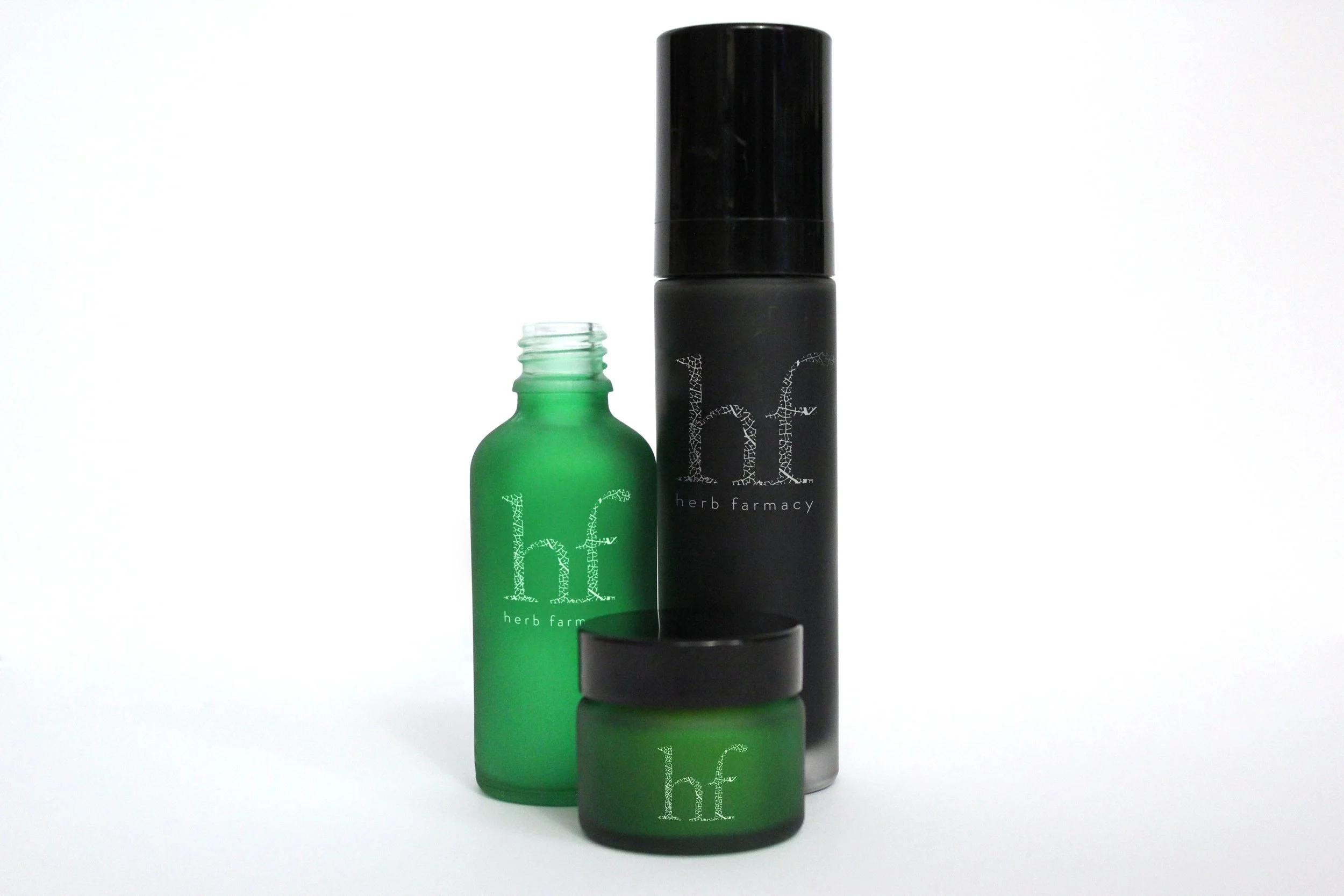
Herb farmacy: Brand identity
Herb farmacy have been growing herbs for over 30 years on their Herefordshire farm. When they developed their skincare range of creams, balms and oils it was integral that the new logo should reflect their organic and ethically made farming practices.
With this in mind, my concept drew comparison between a magnified view of a marshmallow leaf structure and the pores from human skin. The comparison was symbolic of what comes out of the ground goes straight onto the skin without any additional or unknown ingredients being added. As quoted on their website the user has ‘comfort and reassurance in knowing that nature has been allowed to provide its very best to the ingredients, that plants and wildlife have been treated with respect and that the products you use are individually made with care’.
Whilst my pitch idea was unsuccessful I was still pleased with the way it turned out.


